
Case Study: Café Luna
Executive Summary
I was tasked with developing a mobile app for ordering and receiving food for delivery or pickup for Café Luna. I conducted directed storytelling interviews to establish my user goal statement, then built wireframes, developed a sitemap, and iterated to a functional prototype for user testing.
Tools Used
Pen and paper
Figma
Identify
Directed Storytelling
I began this project by conducting 3 directed storytelling user interviews. 2 were over the phone and 1 was in person. I asked the same set of 13 questions to all participants, with some variation in follow-up questions based on responses. The interviews ranged from 20-30 min depending on the participant.
Participants were intentionally chosen from a similar demographic to focus design direction.
I analyzed the results to synthesize similarities and differences among users. 4 commonalities emerged from my analysis:
Ease of use
Details on food and the ability to customize order
Clear communication on time and price
Accuracy of order
From my analysis, I developed my user goal statement.
Overview
User Goal Statement
My user group is young working adults who want a quick and reliable way to order and customize food for themselves or a group for takeout, with clear communication on price and pick-up time, so that they can feel relaxed and enjoy their meal.
DESIGN
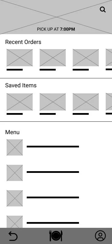
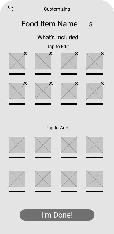
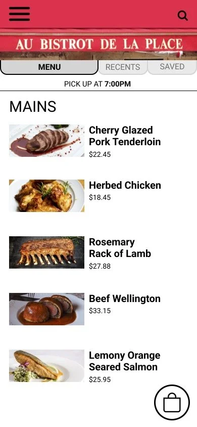
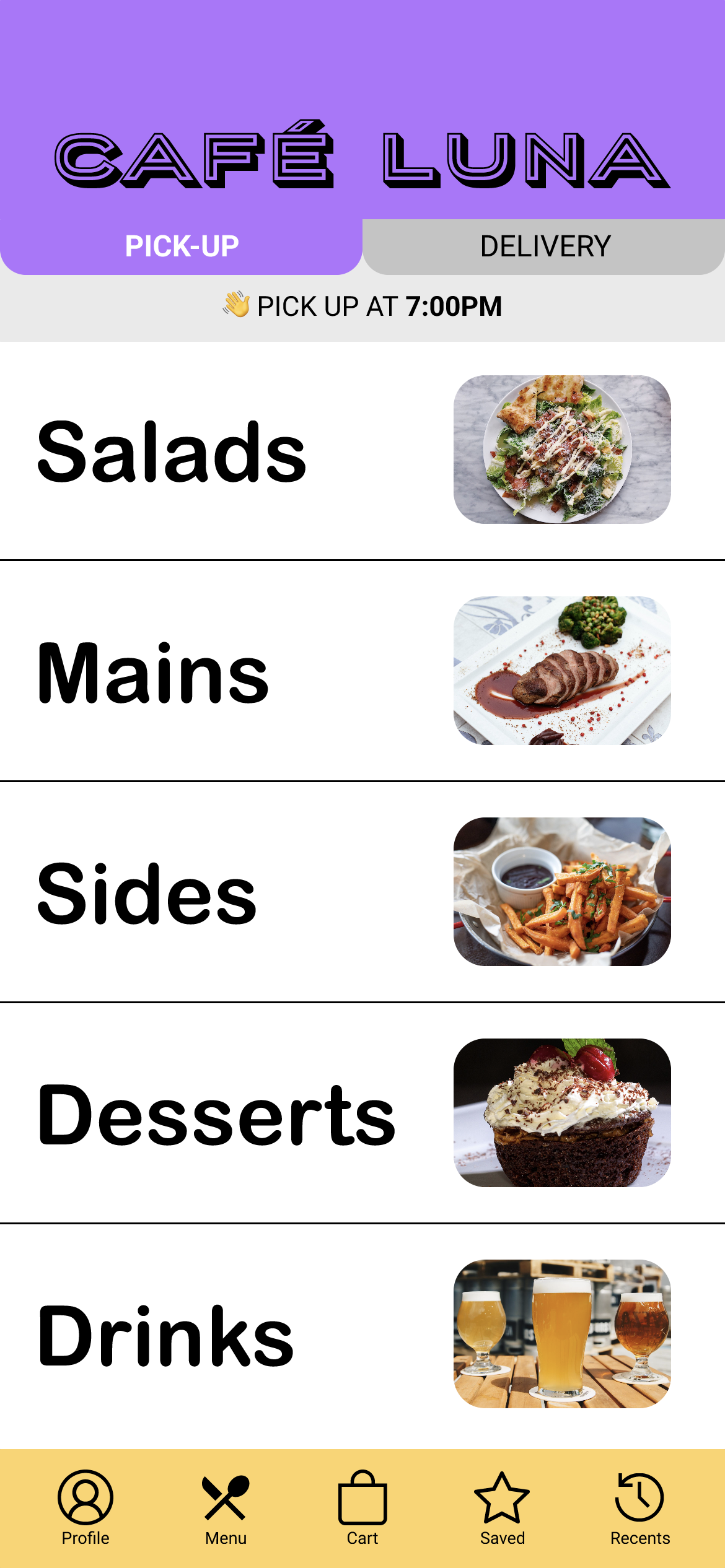
Wireframes
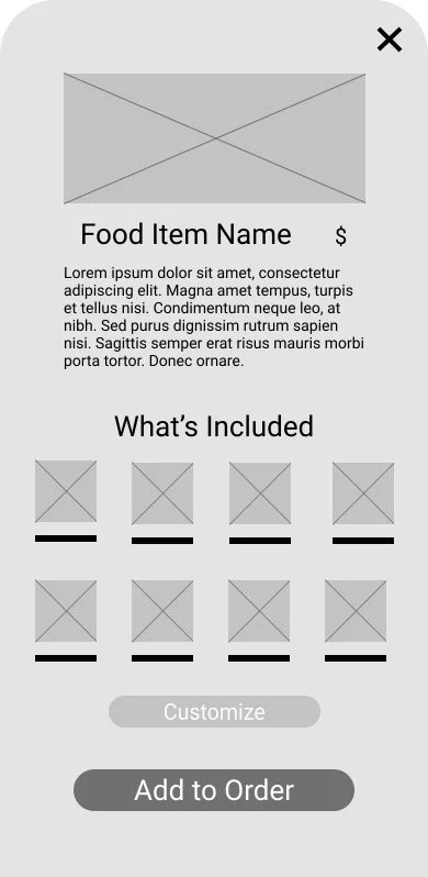
I hand-sketched wireframes for key screens of the app. My design decisions were directly informed by my directed storytelling analysis. I prioritized including key information and functions that were common amongst my users. I sketched 5 versions of each screen, then took inventory of which components would be most helpful to users from each version. From there, I sketched a final draft screen, incorporating the best elements from each version.
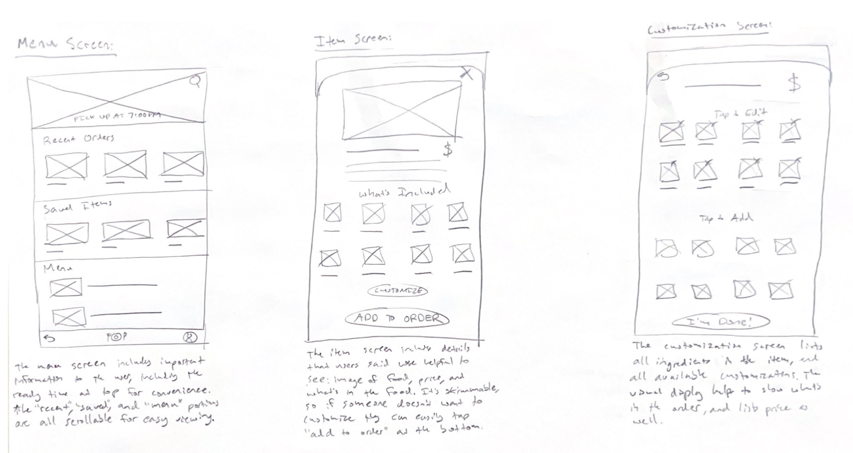

I then translated my hand-sketched wireframes to low-fidelity digital wireframes in Figma.
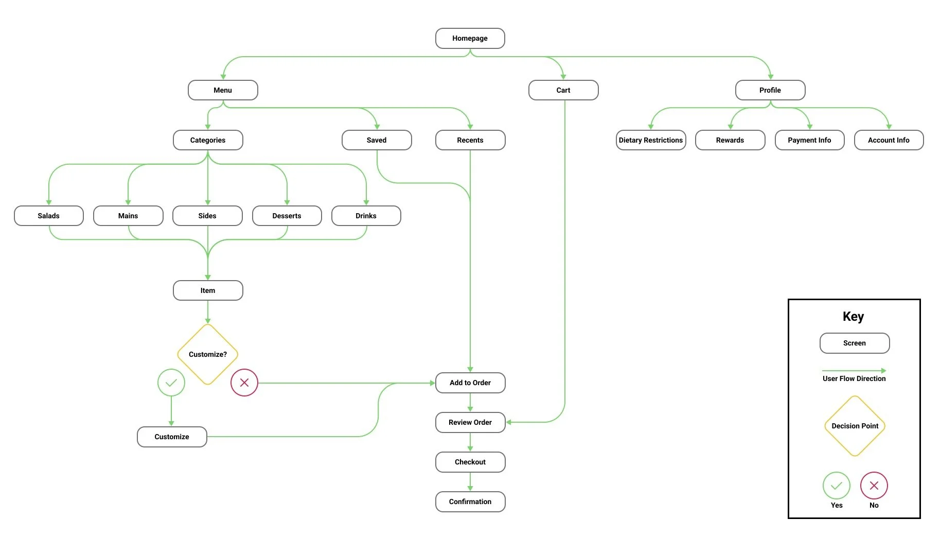
Architecture Diagram
After sketching my initial wireframes, I developed a sitemap that was informed by my directed storytelling interviews, user goal statement, and researching competitors for common design decisions.
Methods Used
Directed storytelling
Wireframing
Information architecture
Prototyping
User testing
Iterations
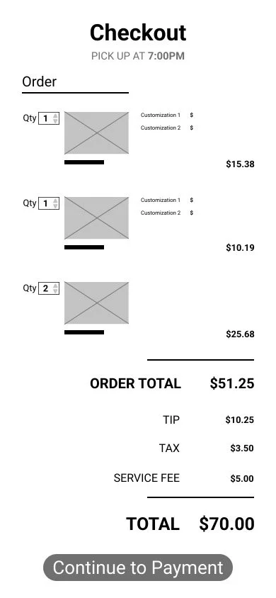
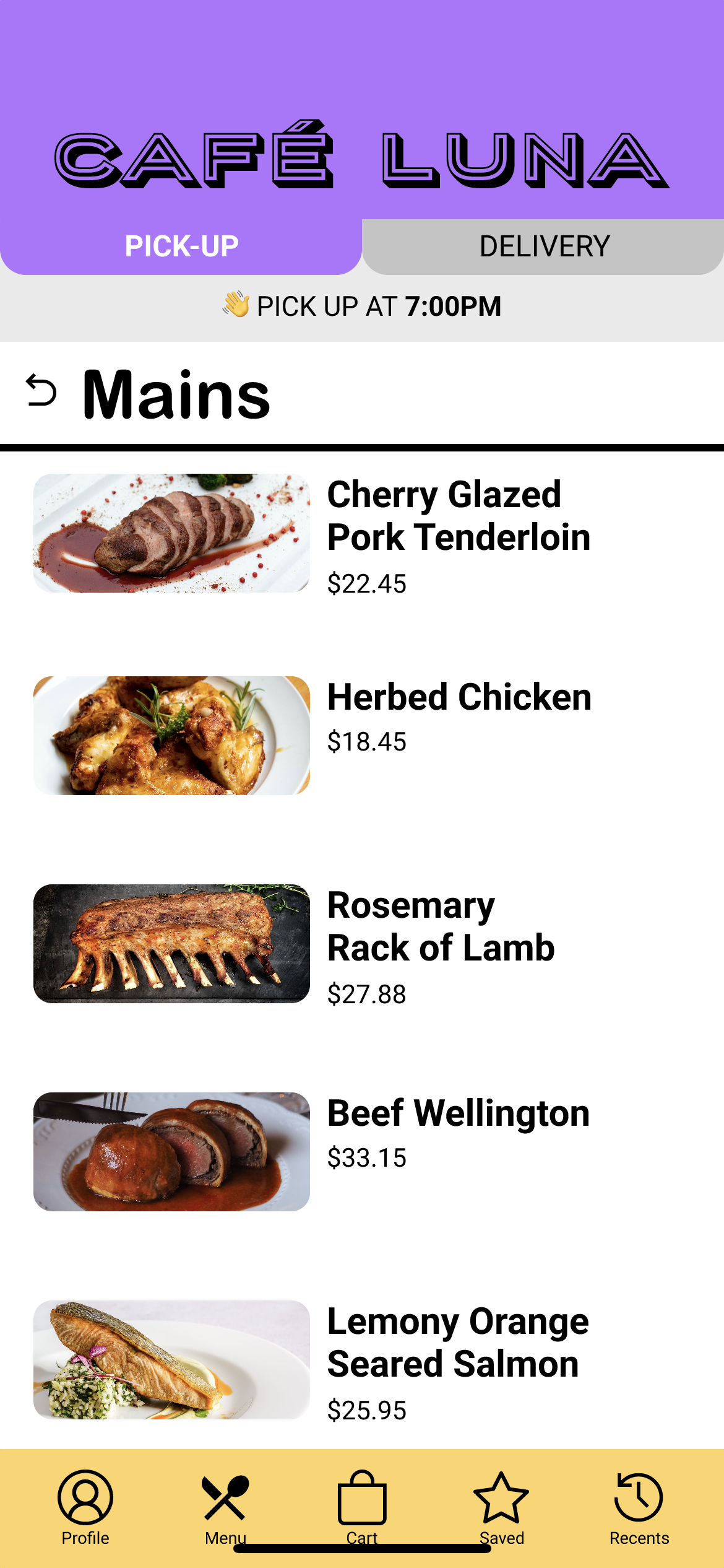
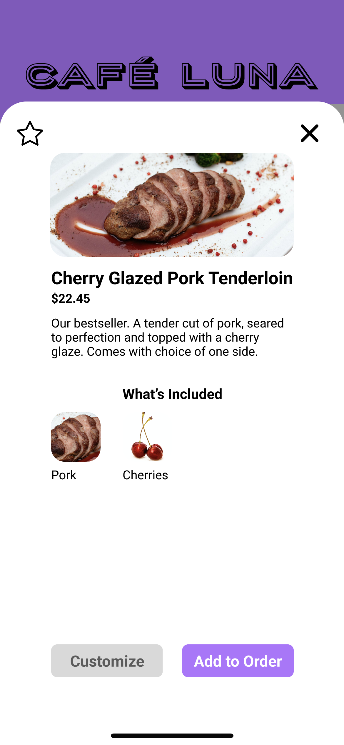
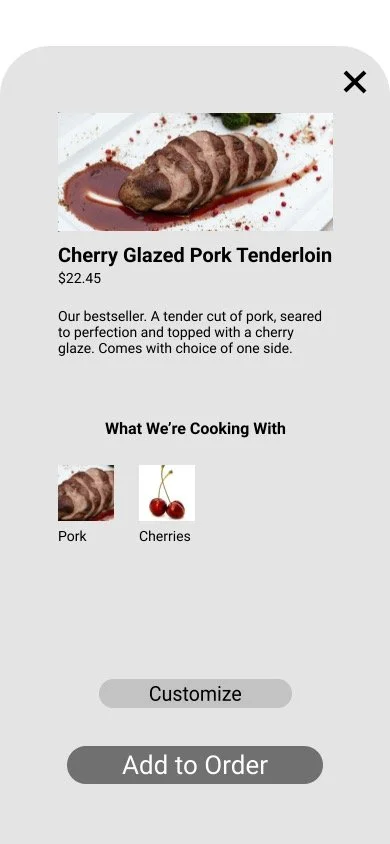
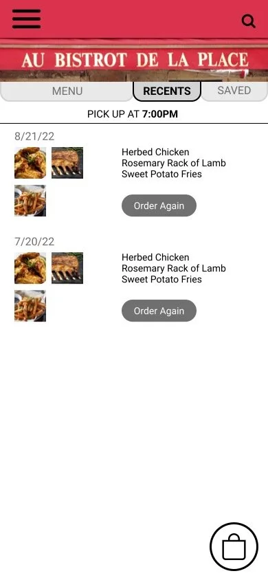
Using my sitemap as a guide, I iterated on my low-fidelity wireframes. I updated the navigation and information architecture of my screens. I also added copy and images to create mid-fidelity wireframes.
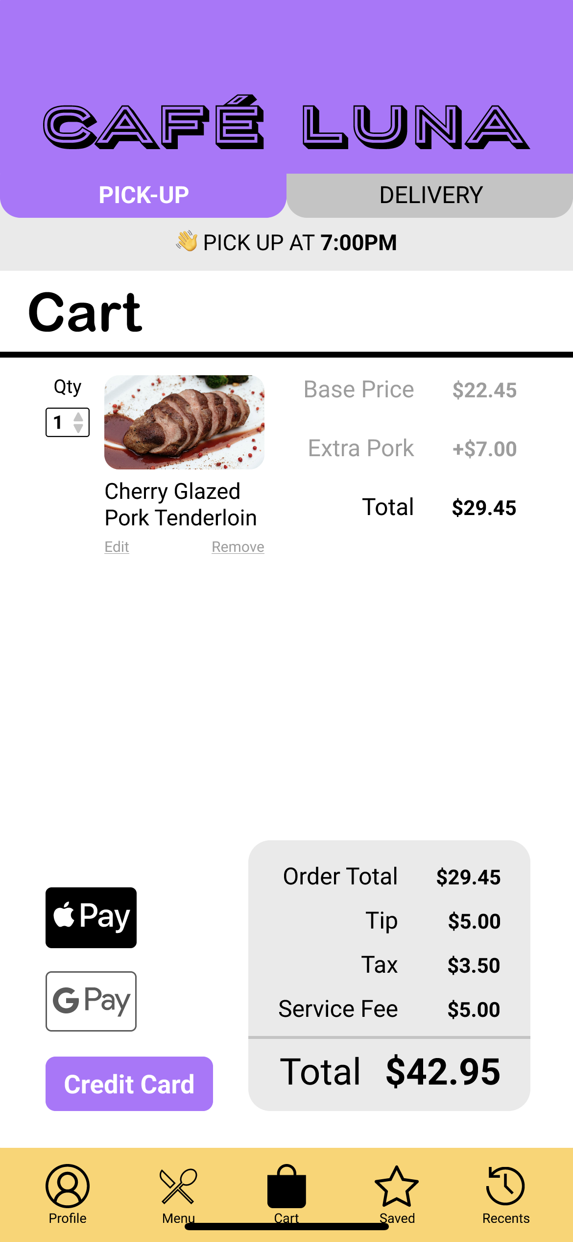
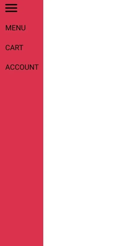
After receiving feedback on the mid-fidelity wireframes from several teammates, I further iterated on the design, with specific attention to creating a navigation bar. I moved away from a hamburger menu to a static nav bar across all screens. This meet’s user’s needs better by presenting important pages like “Menu”, “Account”, and “Cart” clearly across all pages.
Interactive Prototype
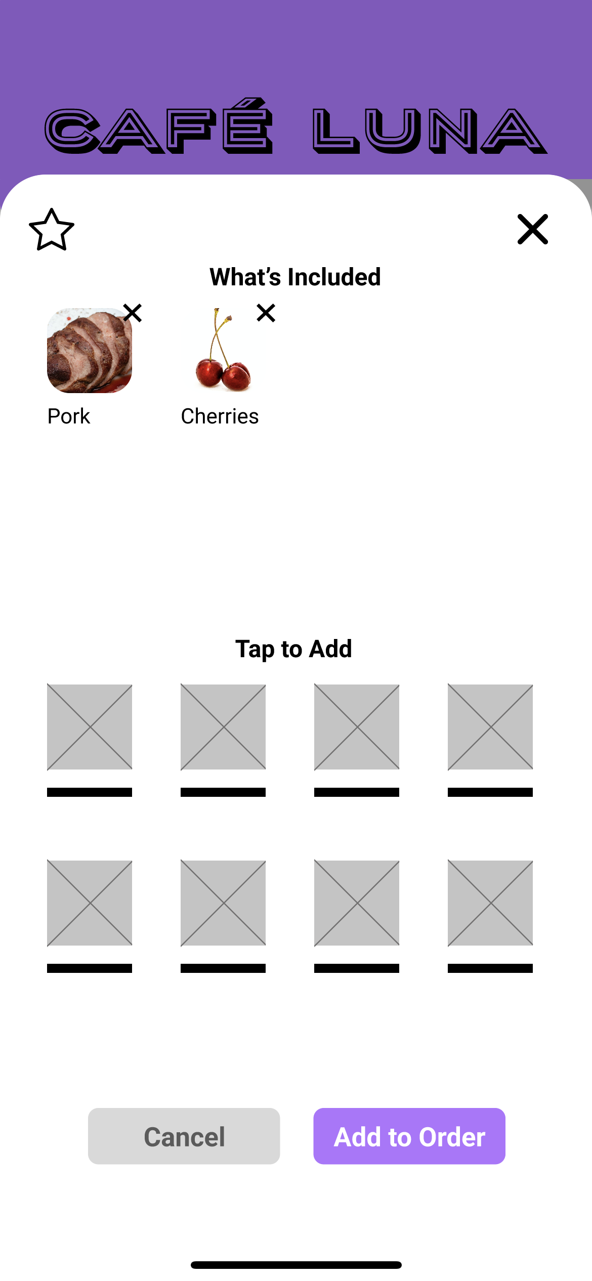
I constructed an interactive prototype in Figma with my existing wireframes, and built a few additional wireframes to complete my user flow. I focused on some simple animations, such as an overlay for food items and customizations.
Usability Tests
Based on the insights synthesized from my directed storytelling interviews, I set the following test goals for my usability tests:
Gain insight into the speed of key task flows.
Assess clarity of order time and cost.
Examine the importance of details presented about a food item and the subsequent ability to customize a food item.
I then conducted 4 think-aloud usability tests. 3 were over FaceTime and 1 was in person. I followed a written script to ensure consistency across the tests and recorded the tests for future reference. I instructed users to complete the following 4 tasks with the prototype:
Add a food item without customization to your cart.
Customize a food item, save it as a favorite, and add to your cart.
Tell me how much your order is going to cost.
Tell me if the food will be ready faster with pick-up or delivery.
Analysis
EVALUATE
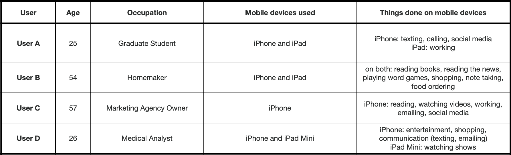
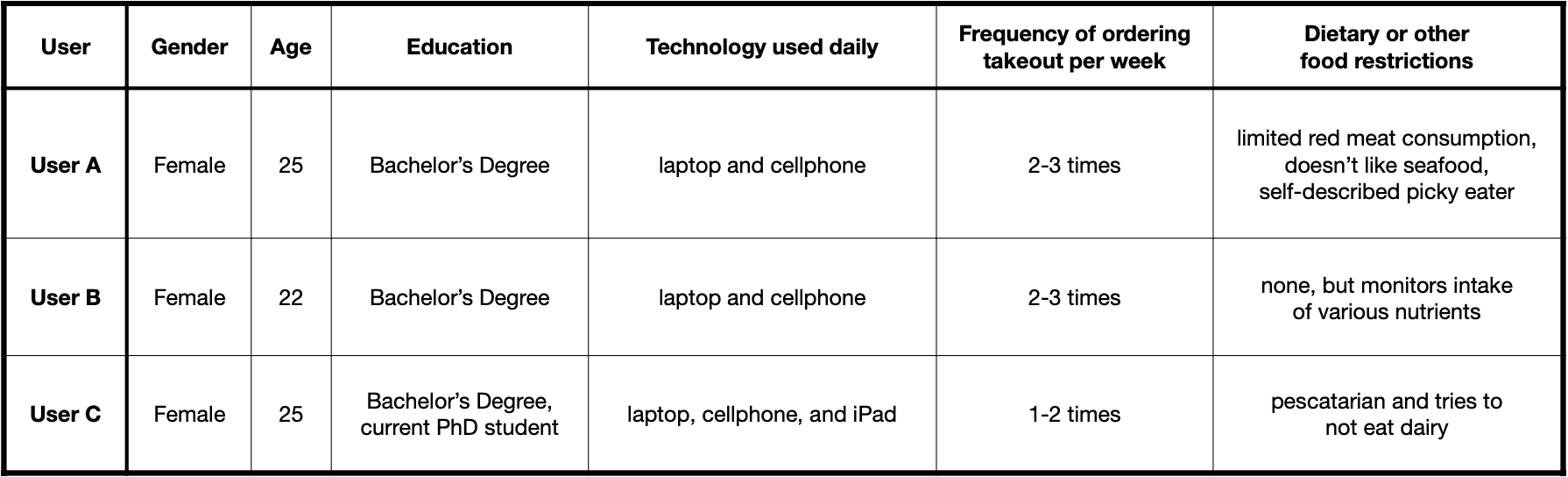
Demographics of usability test participants
I synthesized insights from the usability tests to determine the following recommendations for changes:
Add cart indicator when an item is added to the cart (ex, add a number to the cart icon in the navigation bar) to increase confidence in order accuracy.
Add indication that an item has been customized when it’s saved to favorites.
Move ready time into the tabs for both delivery and pick-up for even clearer communication and to reduce friction.
Rename item total in cart so that it’s clearly different than the order total. Add preset tip buttons in cart (ex: 10%, 15%, 20%, 25%, custom, no tip).
Expand menu options to include vegetarian and other dietary restrictions, even when prototyping, to be more accessible.
Next Steps
To continue this project, I would make the recommended changes and additions gathered from my user testing. I would also build out more screens from my user flow and conduct further testing to refine the design.