HMI Software Design
Role: UX Researcher, UX Designer
Summary: Delkor Systems had spent six years trying to modernize their packaging machine software with nothing to show for it. In four months, I led the UX research and design to redesign their HMI interface from the ground up — fixing a navigation system that left operators lost, clarifying machine status at a glance, and bringing the visual standard up to where it needed to be. The work was presented at Rockwell Automation's Automation Fair, where 50 industry professionals rated the visual design 4.7 out of 5.
Industry: Packaging Equipment
Situation
A machine interface that got in the way.
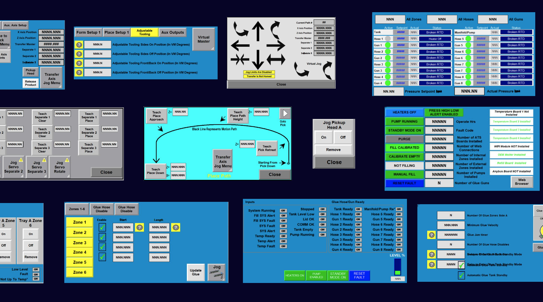
Delkor Systems builds high-performance packaging machines, but their HMI software hadn't kept pace. The interface was hard to navigate, system status was unclear, and controls had been added over the years without any real structure. For operators on a production floor, that's a problem.
Delkor had spent six years trying to fix it internally with little progress made. They came to us needing a fresh start and a hard deadline.
Task
World-class design and user experience done fast.
The ask was ambitious for a four-month window: design an experience that required minimal operator training, work across all of Delkor's machine types on a single platform, and position Delkor as a leader in the space. The deadline was fixed — the work would be presented at Rockwell Automation's national conference.
Deep discovery, iterative design.
Action
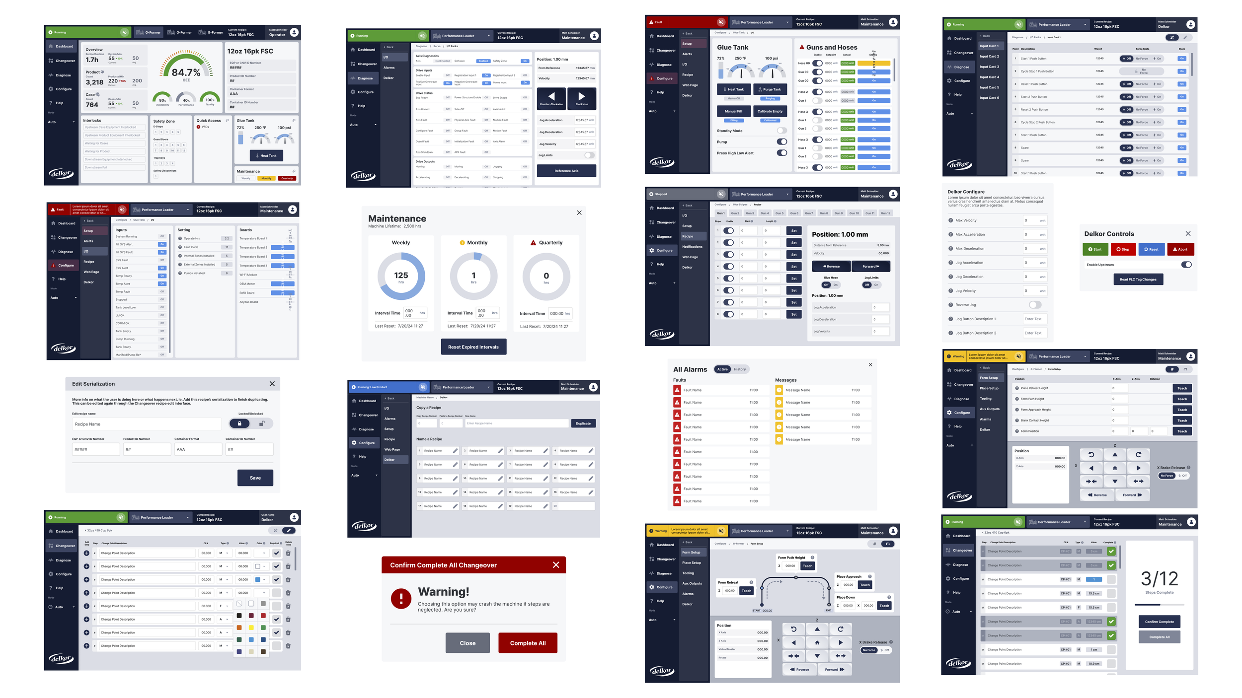
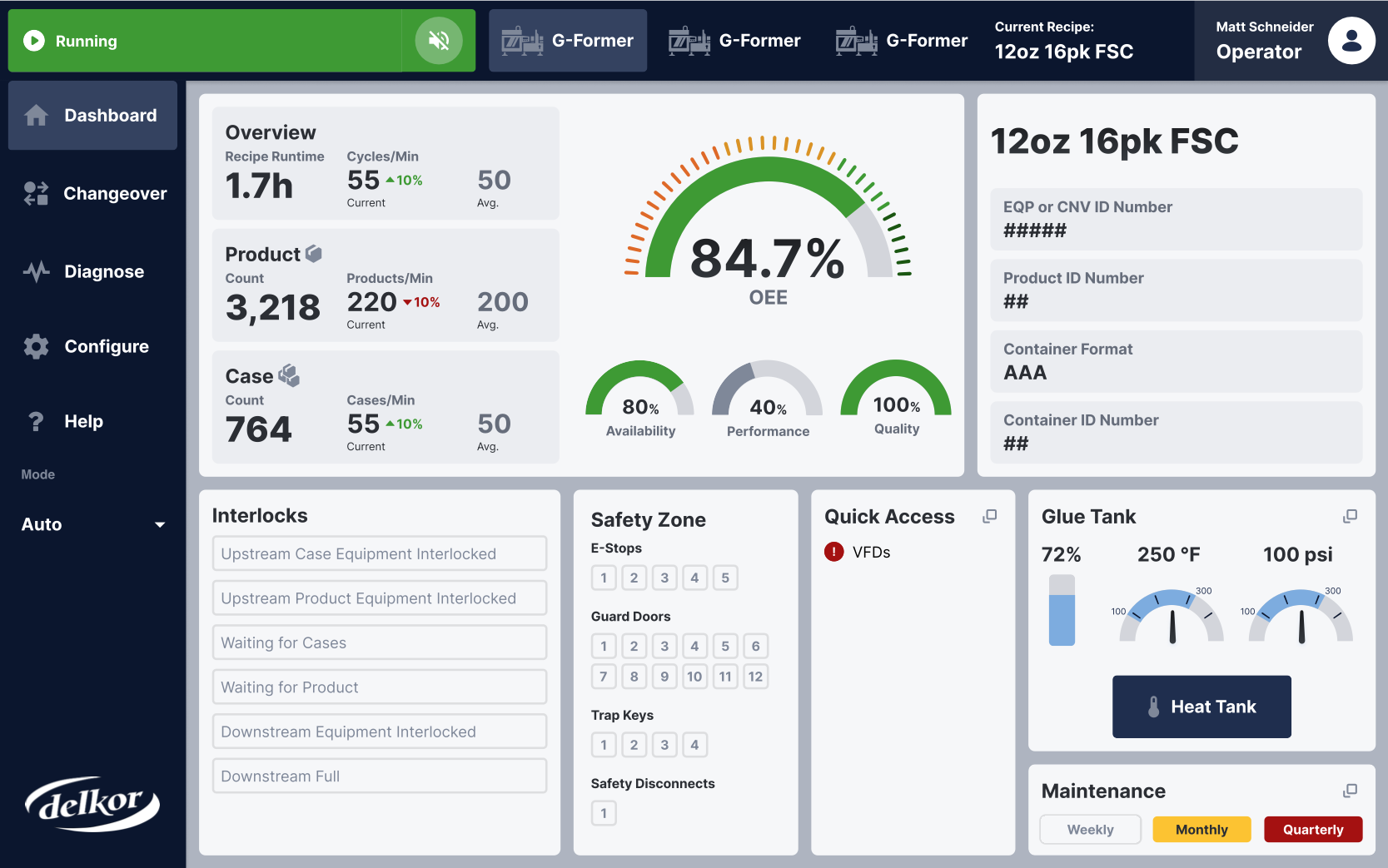
I led discovery end-to-end, starting with a contextual inquiry at Delkor's production facility. Watching operators use the software in person made the problems impossible to ignore. Screens had no clear hierarchy, controls were scattered, and there was no way to tell where you were in the system at any given moment.
From there I audited every screen with questions like: who is this for, what needs to happen here, and what comes next? That became the foundation for a new information architecture. We went through a lot of navigation iterations before landing on a persistent nav that gave operators constant context no matter where they were in the experience.
System status got a full redesign too. Machine states like running, faulted, and idle needed to be readable immediately, with clear visual separation between fault types. We also raised the overall visual quality considerably, bringing the interface up to modern industrial software standards.
I collaborated closely with a UI designer, our PM, and Delkor's lead engineer throughout. Engineering constraints shaped design decisions rather than blocked them.
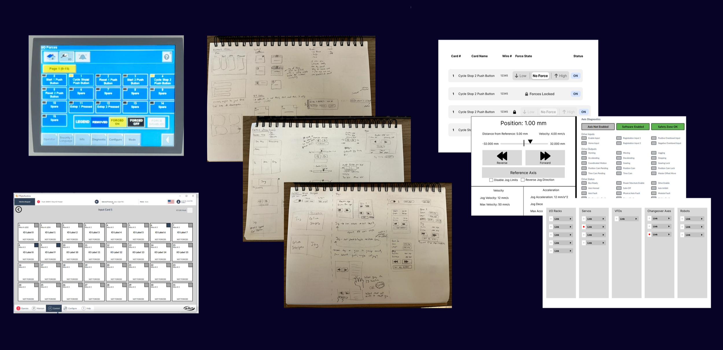
Several examples of my iterative creative process are shown below.
Hand sketches and digital sketches
Result
Validated on a national stage.
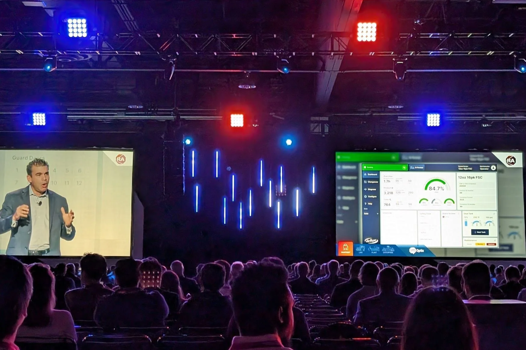
The work was presented at Rockwell Automation's Automation Fair as an example of advanced technology capabilities. We surveyed 50 attendees on-site, a mix of engineers, operators, and industry professionals who are the actual end users for this kind of software.
Visual design rated 4.7/5 by 50 industry professionals
Delivered in 4 months, compared to six years of internal attempts that never gained traction
Designed as a single unified platform across all of Delkor's machine types
Operational testing is coming as machines become available. The conference reception and survey scores are strong early indicators for a product that will keep being validated in the field.